InDesign Projects
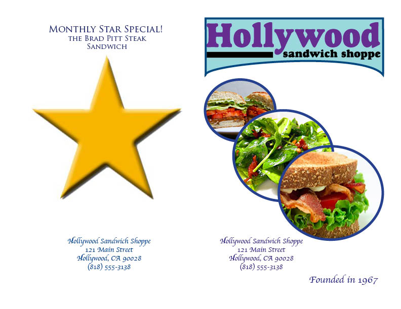
For the front page I did a simple design with the title but made it noticeable compared to the other writing so that more attention would be drawn to the name. I chose cursive handwriting to resemble the old time Hollywood theme. I also thought the cursive was classier for the name. I filled the front with pictures of sandwiches and salads to show the versatility of the food. I included the basic information of the restaurant for people to remember. I also included a date when it was founded to give it more history and meaning for being open for a while. I chose the color theme of light and dark blue because blue is a tranquil color and you want your customer to feel that they can relax and enjoy their meal. For the main menu I chose to make the food a bigger font and all caps to make it easier to read for the customers. I also included tabs to separate the price from the item, which also makes it easier to read. Each food category is separated and underlined to make each category prominent on the page. I starred the monthly special and called it the “monthly star special” to give it a more important meaning and to represent it as a Hollywood celebrity. I chose Brad Pitt because he is a very well known actor that many love. I made the “free refills” smaller than the food font to separate it from the food. Lastly, on the back of the menu I included a picture of Brad Pitt and said to look for the monthly star special. I also made it simple by putting a big star on the back as a sign of Hollywood. And I also included the basic information on the back because when someone flips over their menu when ready to order they will be reading the back.
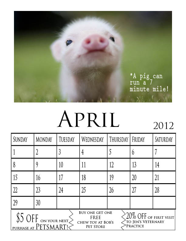
For the calendar I did the month in big letters to give it emphasis. I also chose colors that I knew that people are usually attracted to. For the pictures, I chose animals that are cute and helpless so someone feels the need to help them. For the coupons I did zig zag lines so that they resemble coupons more.
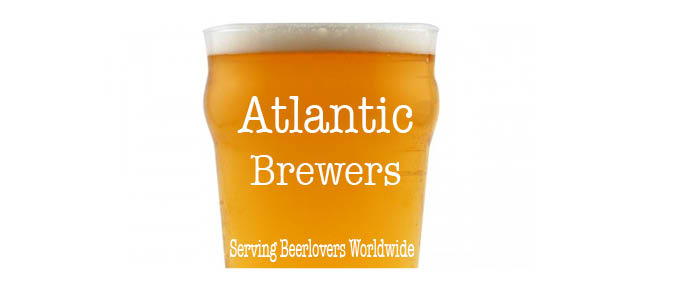
For Atlantic Brewers I wrote the name on the front in American Typewriter to give it the all American beer feel. I wrote “Serving Beerlovers Worldwide” so that consumers would know that Atlantic Brewers distributes around the world. The background is half a pint of beer so that it will cause the consumer to drool of the appetizing beer. I cut off half the beer glass so most attention would be on the words rather than the picture. The foam adds a fun top to the picture. The logo is easy to remember and the words flow well on the image. I centered the “Atlantic Brewers” to capture the attention of the audience and with only two words I feel like it is able to be centered easily. The logo “Serving Beerlovers Worldwide” is both catchy and fun. It is easy to remember and gets the point across well. I put it along the bottom so that after reading the name of the brewery the person’s eyes will go straight to the slogan. I used the same font for the slogan as the main name so that it would flow well.